Design Language System
Honeywell
The Brief
As part of Honeywell’s digital transformation, it was identified that the current design language components were outdated, and no longer fit for purpose. The aesthetics looked dated, did not pass accessibility and inclusivity guidelines, and were not mobile responsive. We were tasked with updating the data visualisation components, which aside from global elements were the most used across all products.
These components are used across the entire company in a wide array of products, including in our connected buildings, aerospace, industrial and cybersecurity verticals. There was a widespread lack of consistency in how these components were being used, both in visualisations and behaviours. This was in part due to a lack of comprehensive documentation for the components and corresponding design libraries.
We targeted two main personas, being the internal designers who would use the components, and the external consumers of the products built from them.
My role: Senior UX designer from product inception to MVP
Key Design Challenges
Standardise how designers select appropriate chart representation and data relationships across global business units
Reconcile all use cases of components and standards across all business units - for example, how alert colours worked in different business units and the tension of uniting the differences for a standard guideline
Key optimisation metrics to meet:
Accuracy
Speed
Aesthetics
Accessibility
Readability
Comprehension
Clear hierarchy of information – how to maintain visual harmony while ensuring data importance stayed intact
The Solution
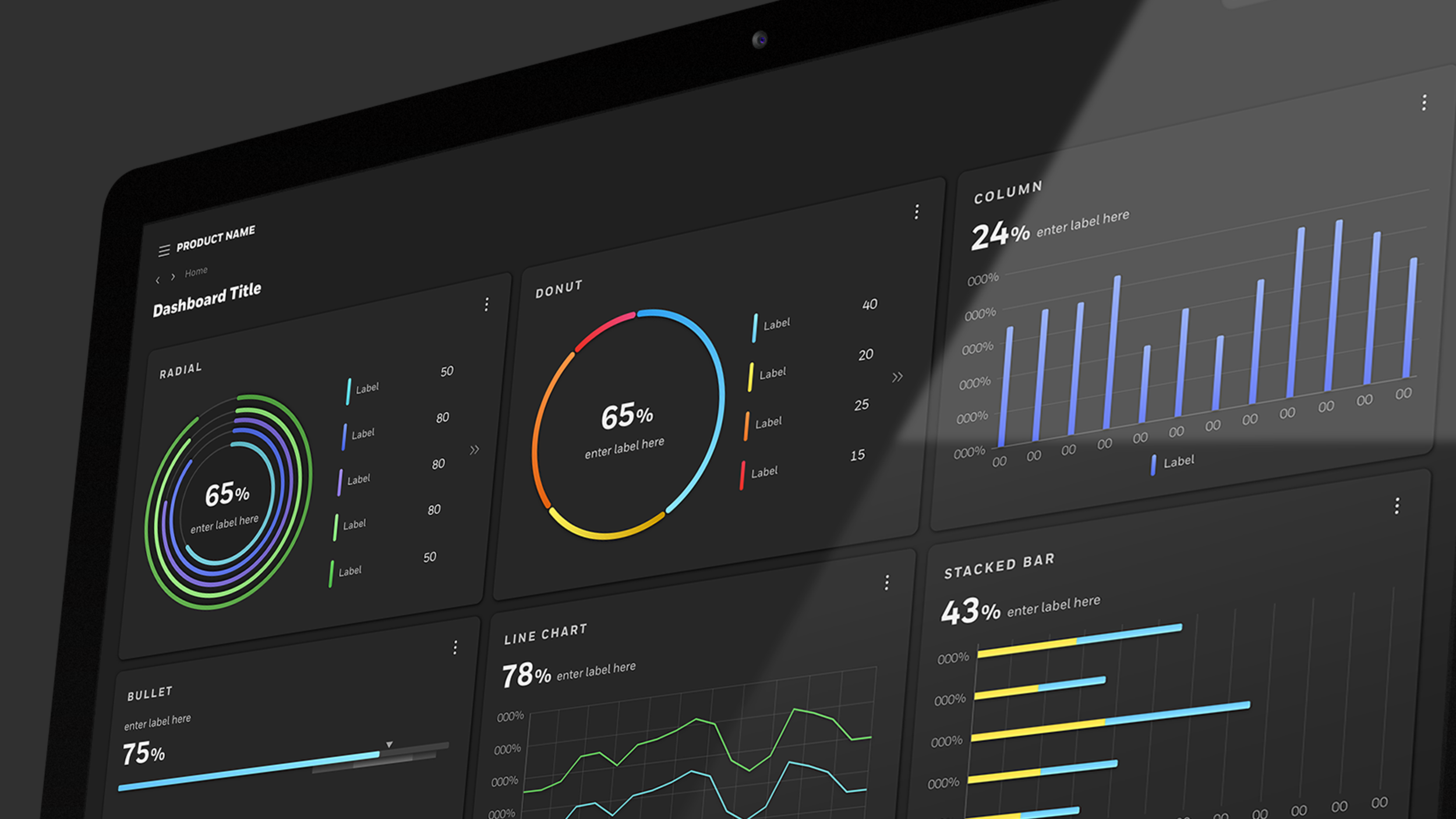
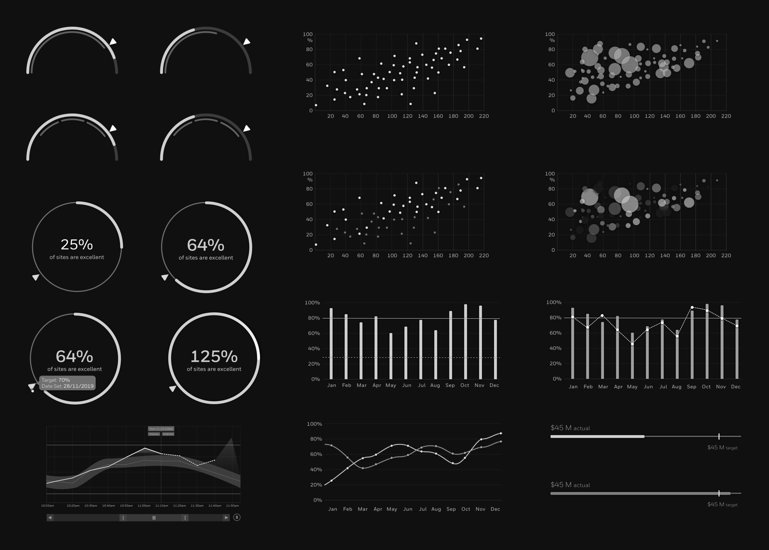
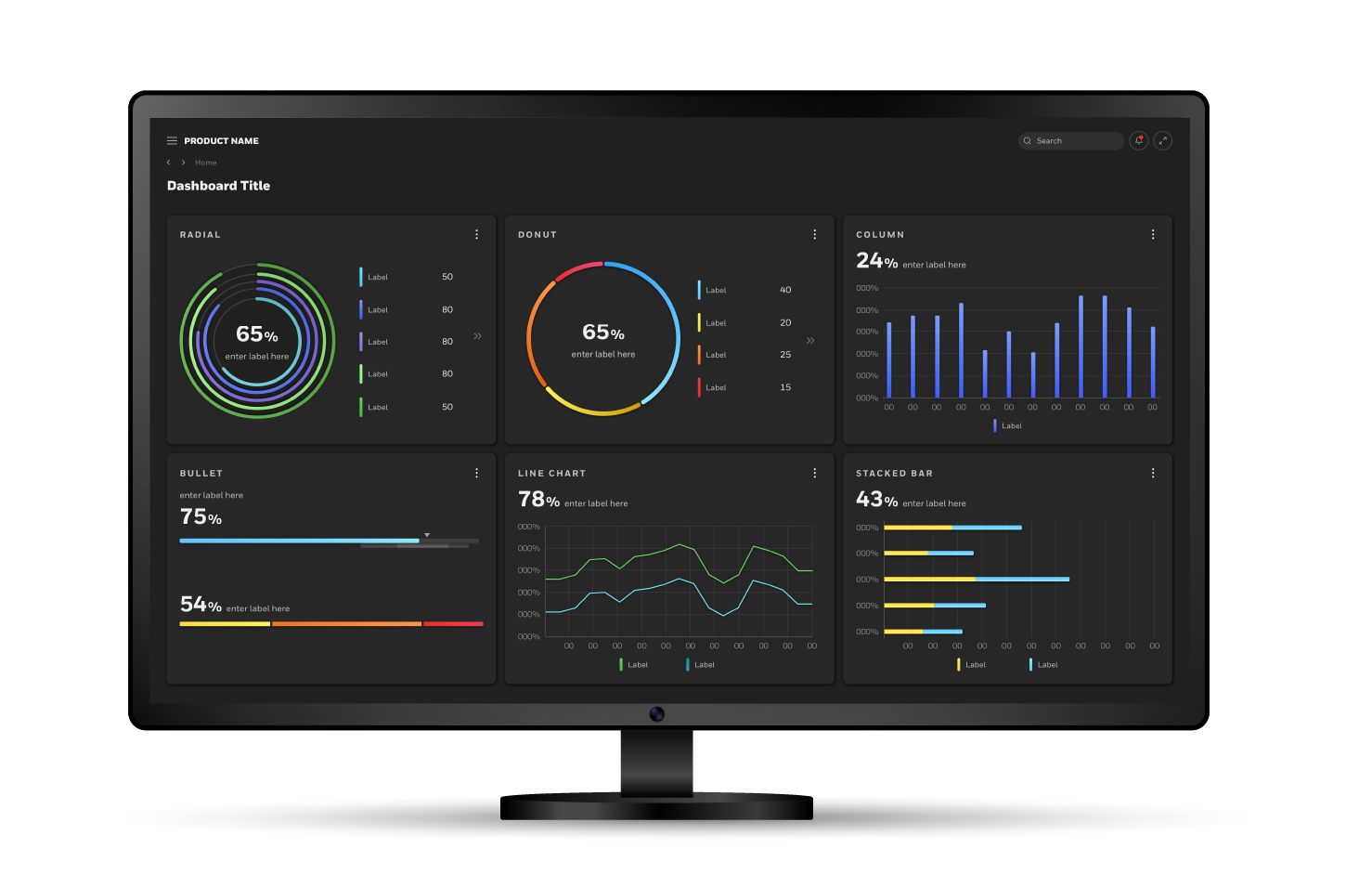
After extensively documenting best practices for data visualisation and collecting use cases from all the different products, we defined the chart types that were needed and started prototyping and testing different designs. This process went through several stages and reviews, and I led the effort to refine and condense all the different design options into one cohesive set of components.
Every element for each chart was critically analysed and optimised for the key metrics detailed above, down to the thickness of the gridlines and intensity of the shadows.
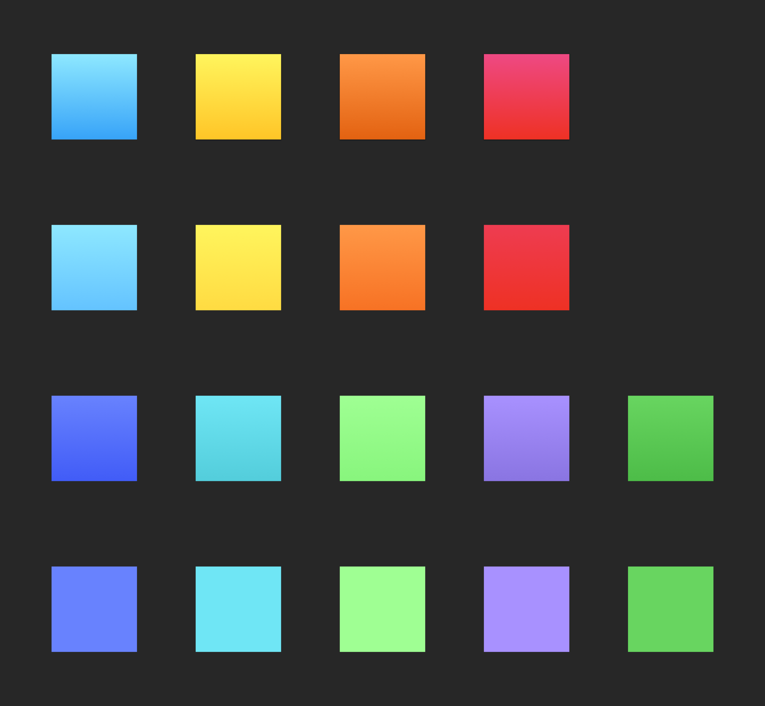
Colour was a large part of the solution, as they are imbued with meaning depending on context. After extensive research and collaborative reviews with senior leadership, stakeholders and designers from all parts of the globe, I created a palette of carefully curated solids and gradients to be used in the charts for both dark and light theme. Accompanying this palette was detailed documentation, to ensure the colours were used in a consistent manner across business units.
Our products often had quite a few charts within the same page, so maintaining visual harmony while following a clear hierarchy of information was key. This was achieved after extensive testing, utilising consistent placement of primary data, chart structure and aesthetics.
This culminated in the creation of extensive, detailed and flexible Sketch libraries and documentation, so that other designers could easily access and customise the charts as needed and bring much needed standardisation across all products.
Technical Skills
Sketch
Abstract
Figma
Adobe Aftereffects
Design Skills
UX research, including case studies of all Honeywell products
Wire-framing and prototyping
Usability testing and feedback sessions
Rapid prototype iteration based on feedback
Development of robust Sketch Libraries
Product delivery with development teams